Why Your Website Is Your Best Salesperson (Working 24/7)
There is a shift in perspective I see many entrepreneurs and professionals struggle with: considering their website as a mere “digital brochure” or a glorified “business card.” Something you have to have because everyone else does, to be stamped at the bottom of emails and forgotten.
If that is your approach, your site will only ever be an expense.
The reality is that a well-designed website is your company’s best salesperson. It works 24 hours a day, 7 days a week, never takes a day off, never gets sick, and answers hundreds of potential clients simultaneously with the exact same precision.
But for this “digital salesperson” to close deals while you sleep, it must be properly trained. Here are the three fundamental elements to turn visitors into clients, without ever having to pick up the phone.
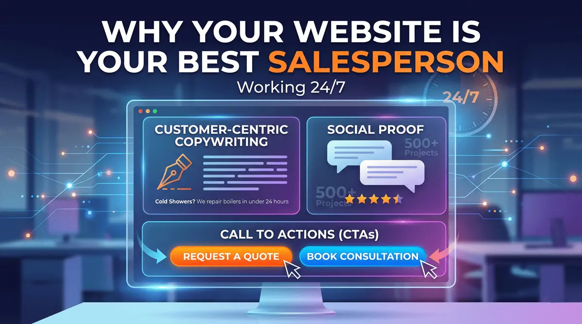
1. Customer-Centric Copywriting
Most corporate websites suffer from “Ego Syndrome”: the Home Page is a wall of text stating, «We are a leading company in the industry, founded in 1990 by a dynamic young team…». Your visitor doesn’t care (at least not at first). The visitor landed on your site because they have a problem and want to know if you can solve it.
Your digital salesperson must speak directly to them. Instead of saying: “We install high-quality plumbing systems”, your site should say: “Cold showers? We repair your boiler in under 24 hours”. The text must be clear, scannable (with bullet points and short paragraphs), and focused on the real benefits the client will get by choosing you, not just the technical features of your service.
2. The Art of Social Proof
Imagine walking in an unfamiliar city and having to choose between two adjacent restaurants: one is empty, the other has a line out the door. Which one do you choose? Human instinct leads us to trust the choices of others. On the web, this mechanism is called Social Proof.
If your site just says how great you are, it’s just self-promotion. But if your clients say it, it becomes a guarantee. To turn your site into a sales machine, you must include:
- Real Testimonials: With first name, last name, and (if possible) a photo or company logo.
- Case Studies: Don’t just show a picture of the finished product. Tell the story of the client’s initial problem, the solution you applied, and the measurable results you achieved.
- Certifications and Numbers: Showing logos of trusted partners or concrete data (“Over 500 projects delivered”) breaks down initial skepticism.
3. Unmistakable Call to Actions (CTAs)
Your visitor has read the text, understands you can solve their problem, and trusts your reviews. Now what? If you don’t tell them exactly what to do, they will close the page. A good salesperson doesn’t give a presentation and then walk away in silence: they ask for the close.
Your Call to Actions shouldn’t be hidden or shy. Avoid generic phrases like “Learn more” or “Click here”. Use clear action verbs that explain exactly what will happen next:
- “Request a Free Quote”
- “Book a 30-Minute Consultation”
- “Download the 2027 Catalog”
CTAs should be in a color that pops against the rest of the design (to catch the eye) and must be strategically scattered throughout the reading journey, not just relegated to a sad “Contact” page.
Conclusion
Building a high-performance website (optimizing speed, SEO, and technical infrastructure with tools like Astro) is vital to bringing users to your door. But once they are inside, it’s the psychological structure of the page that does the heavy lifting. Investing in a strategic website doesn’t mean spending money on IT; it means hiring the most efficient salesperson your company will ever have on its payroll.